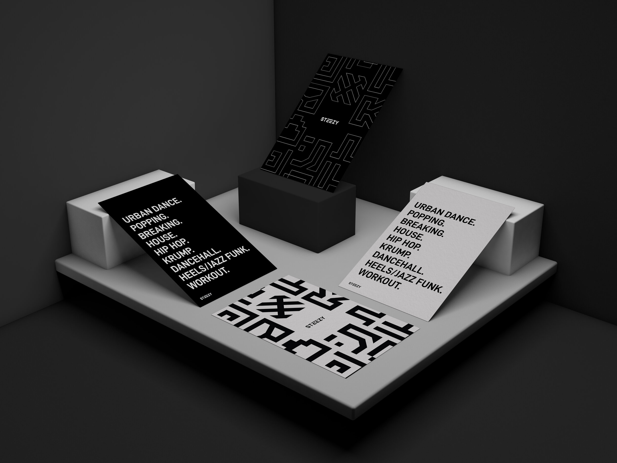
Dance Iconography
ROLE:
Iconography
This is a mock project with STEEZY Studio with the objective to develop an iconography system that represents a collection of dance styles.
The Concept
The main element that I chose for the iconography is the bar above the two E’s in the logo. I believe it was fitting to utilize the shape for brand consistency, uniqueness and versatility for various applications and future dance styles in the catalogue.
The inspiration for the icons came from my imagination of the grids as giant cubes with a dancer for each style placed inside it and examined the transformation of each space through their movement.
The same principle is shared to each icon all throughout using the same style and weight. The goal is to showcase the different personalities for each dance style icon, yet still appearing aesthetically from the same family.
The Breakdown
-

Urban Dance
The influence of Urban Dance is essentially based on the choreographer’s/dancer’s own interpretation of the music, and a mixture of dance styles/backgrounds. Because of this, I traced the bottom of the grid to form the letter “U” as if it is a frame or vessel for the dancer to portray their story.
-

Krump
The inspiration behind this design comes from the concept of an explosive, as Krump is known for its raw and powerful movement. When the icon is rotated to the left, it symbolizes the snapshot of the spark right at the end of the wick - a mock of the moment before the bomb explodes.
-

Popping
The inspiration behind this design came from the dance style’s unique movement. Some styles of popping are isolation, animation, boogaloo, the robot, just to name a few. The “P” icon is a reflection of many different types of moves within this dance style.
-

Breaking
For this icon I wanted to recognize some of the elements in breakdancing - freezes and power moves, hence the “B” being upside down.
-

House
The “H” icon came from the concept of a dancer going through a sequence of house dance moves within the grid, from the jack, to footwork and other grooves.
-

Dancehall
I was inspired by the fact that this dance style is very down and grounded but requires your whole entire body to move and groove. I rotated the letter “D” to have its bowl face up with grooving patterns as a nod to the flow of energy that goes through the body.
-

Hip-Hop
The design of this icon came from the stripes and road markings from the streets - a nod to Hip hop’s origin and roots. The birth of hip-hop is responsible for the beginning of other art forms, thus I imagined hip hop as a metaphoric bridge for different styles of dance. The icon consists of the two H’s in the shape of road markings on a crosswalk.
-

Jazz Funk & Heels
The process for this icon was fun, I wanted to play around with the concept of having a shape of a heel in the design yet also symbolize something else. The shape of the “J” (for “Jazz”) forms as the heel and it is complemented with the arms of the “F” (for “Funk”) on the top left of the icon.
-

Workout
The icon is inspired by the idea of your heart rate, learning curve and growth. It travels through the grid and forms the right side of the “W”.


